
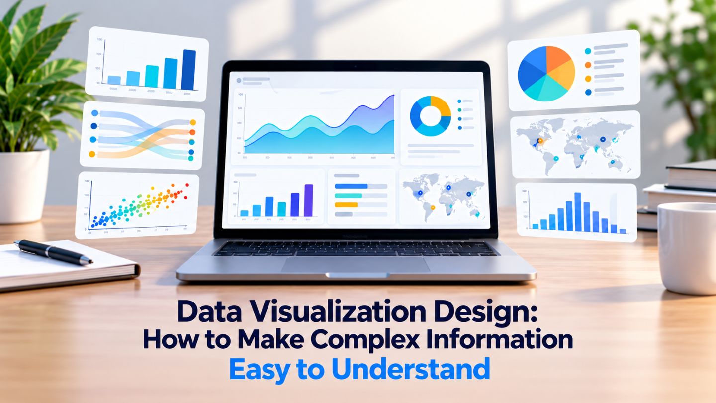
A chart exists to make a point faster than a paragraph could, and most business charts fail at exactly that. They present everything the dataset contains and leave the reader to work out what matters, which defeats the purpose entirely. This blog covers how to design visualizations that communicate rather than merely display, which chart types suit which questions, and the common choices that make data harder to read rather than easier.
Key Takeaways
- Every chart should answer one specific question, not present a dataset.
- Charts intended for digital audiences should remain readable on smaller screens, including phones.
- Color should encode meaning, never decorate.
- Removing elements usually improves comprehension more than adding them.
- Charts must be readable on a phone, where most will be seen.
Start From the Question, Not the Data
The most common failure is building a chart around what the spreadsheet contains rather than what the reader needs to know. That produces visualizations with four series, two axes, and no clear takeaway, technically complete and practically useless.
Before choosing a chart type, write the one sentence you want the reader to leave with. If that sentence is "revenue grew fastest in the northern region," the chart only needs to make that comparison obvious. Everything not serving that sentence is competing with it, and a chart that supports one clear claim beats a chart that supports five vaguely.
Matching Chart Type to Comparison

The choice is less about preference than about what is being compared. Change over time wants a line. Comparison across categories wants bars. Relationship between two numeric variables wants a scatter. Composition of a whole is usually better served by a stacked bar than by a pie, since people judge lengths more accurately than angles.
This kind of deliberate visual choice is part of why icon design and other small graphic decisions matter in interfaces. Pie charts specifically get used far beyond where they work. Two or three segments are readable; seven are not, and the moment you need a legend and percentage labels to interpret it, a bar chart would have communicated the same thing instantly. Defaulting to whatever the tool offers first is how most of these mismatches happen.
Labels and Annotation Do More Than Precision
A chart that shows a pattern without saying what it means leaves the reader to work it out, and many will not bother. A short annotation pointing at the relevant part, or a title stating the conclusion rather than describing the axes, converts a display into a communication.
Titles are particularly wasted. A title reading Revenue by region, 2024 to 2026 describes the chart; one reading Northern region grew fastest despite lower spend states the point. The second version means someone who reads nothing else still leaves with the finding. That is the inverted pyramid applied to a chart: the conclusion first, the supporting detail after it.
Color Should Carry Meaning
Applying a different color to every series because the palette allows it makes a chart look busy and communicates nothing. Color is a strong signal and should be spent deliberately: highlighting the one series that matters while rendering the rest in neutral grey directs attention far more effectively than a full spectrum.
It also needs a redundant channel. Readers with color vision deficiency lose the distinction entirely if hue is the only difference between two lines, so pairing color with line style, direct labels, or position keeps the meaning intact. This is the same principle covered in accessibility considerations in graphic design, applied to data specifically.
Grey Everything, Then Highlight One Thing
Starting from a fully neutral chart and adding color only where the point lives produces clearer results than starting colorful and trying to tone it down.
Read More: Visual Hierarchy in Web Design: How to Guide Users Without Text
Scale and Proportion Carry Meaning
The dimensions of a chart change how a trend reads. A line stretched wide flattens variation; the same data compressed vertically exaggerates it. Neither is dishonest by intent, and both shape the conclusion a reader draws.
A reasonable default is proportions where the change being shown is visible without being dramatic, and keeping those proportions consistent when charts are compared. Rescaling between two charts a reader will compare side by side quietly undermines the comparison you asked them to make.
Subtraction Improves Comprehension
Gridlines at every increment, borders around the plot area, labeled tick marks on both axes, a legend duplicating information already visible, background fills, drop shadows. Each individually seems harmless, and collectively they force the reader to filter before they can read.
Removing nonessential decoration often improves comprehension, provided the chart still retains the labels, scales, and context needed for accurate interpretation. Direct labels on the lines themselves usually beat a separate legend, since they remove the back-and-forth of matching colors to names. The test is whether an element helps someone understand the point faster, and most default chart decoration does not. Decoration that forces a reader to filter before they can read is simply visual friction in another form.
When a Table Beats a Chart
Charts are for patterns; tables are for specific values. If the reader needs to look up an exact figure, a chart forces them to estimate from a position, which is slower and less accurate than reading the number directly.
The useful question is whether the reader wants to compare shapes or retrieve values. Comparison of trends and magnitudes belongs in a chart. Precise lookup belongs in a table, and forcing the wrong one produces a visual that looks more sophisticated and serves the reader worse.
Design for the Screen It Will Be Read On
Charts get designed on a wide monitor and read on a phone, which is where dense visualizations fall apart. Axis labels become unreadable, closely spaced series merge, and anything requiring hover to interpret simply does not work on touch.
That argues for fewer series, larger type, and direct labeling in anything intended for general audiences. A complex chart that requires study belongs in a report someone will sit with; a chart in a blog post or a deck needs to land in seconds. Matching the density to the context is part of the design decision, not an afterthought, and it connects to broader thinking about how skimmable presentation affects engagement.
Honesty in Presentation
Design choices can mislead without anyone intending it. Truncating a bar chart's axis exaggerates differences dramatically. Inconsistent time intervals distort trends. Comparing raw counts across groups of very different sizes implies things the data does not support.
The working standard is that a reasonable reader should draw the same conclusion from the chart as from the underlying numbers. Bar charts should start at zero, intervals should be even, and any scaling decision that amplifies a difference deserves scrutiny before publishing. Credibility lost this way is expensive to rebuild, and the mistake is usually accidental rather than deliberate.
Testing a Chart Before It Ships
The fastest check is showing it to someone unfamiliar with the data and asking what they take from it. If their answer differs from your intended point, the chart is not working regardless of how accurate it is.
That test takes a minute and catches problems no amount of internal review will, because the people who built it cannot un-know what it means. It also frequently reveals that the chart was answering a slightly different question than the one it was commissioned for.
Keeping Charts Consistent Across a Set
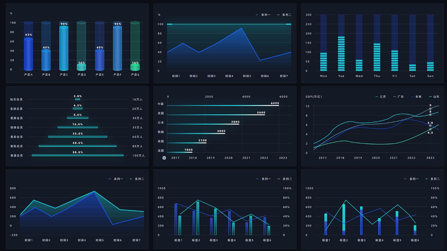
A report or deck containing charts styled differently forces the reader to relearn the visual language on every page. Consistent color meaning, axis treatment, and label placement across a set lets someone read the fifth chart as quickly as the first.
This is worth deciding once as a small set of rules rather than per chart: which color means which category, where labels sit, whether axes start at zero. Applied consistently, it makes a collection of visuals feel like one document rather than several people's work stapled together.
Read More: How Consistent Brand Design Improves Customer Recognition
Making Complex Information Land
Good data visualization is mostly a discipline of restraint: decide the single question the chart answers, pick the type that suits the comparison, spend color only where meaning lives, remove the decoration that came with the template, and check it on a phone before it ships. Charts that try to show everything communicate nothing, and the difference between the two is usually a matter of what was left out rather than what was added.
At The Ocean Marketing, our graphic design services treat data presentation as a communication problem rather than a formatting one. Whether you need help turning research into visuals people actually understand, reviewing existing charts for clarity, or a free SEO audit to see how your site performs overall, our team can help. Contact us and let's make your data easier to grasp.