
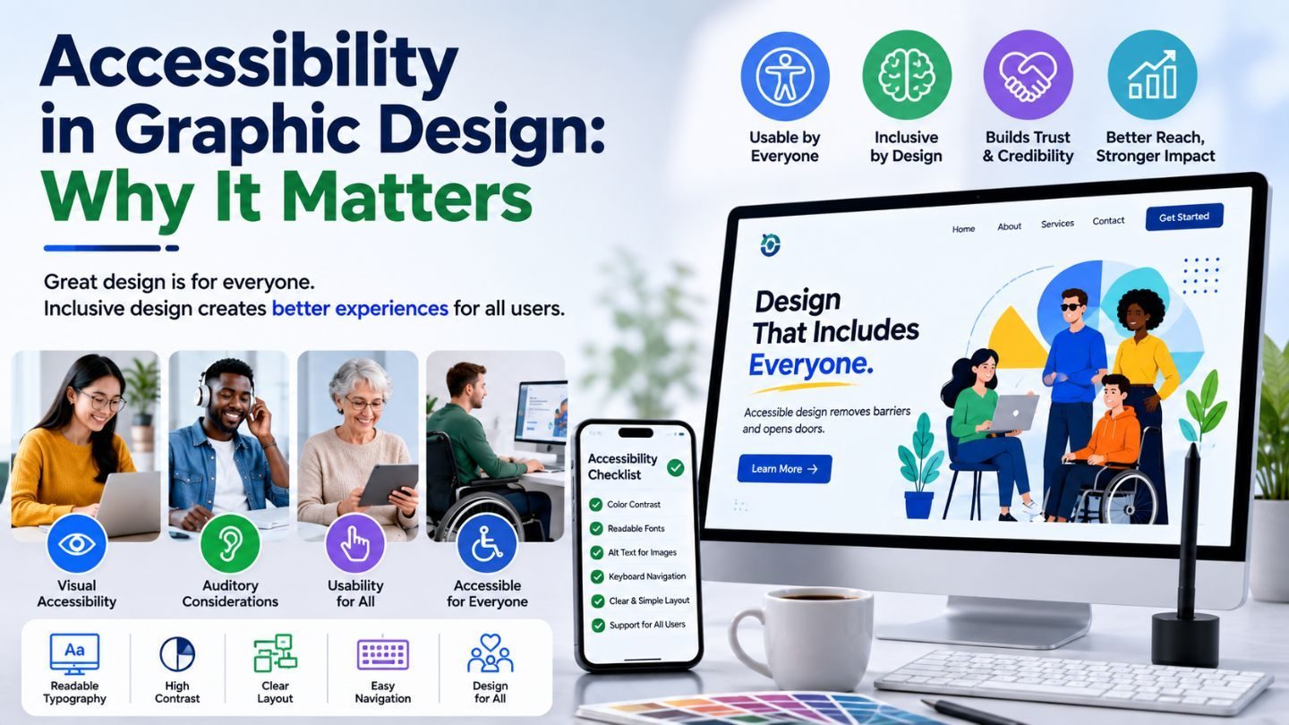
Accessible design gets treated as a compliance chore, something legal mentions once a year. That framing costs businesses money, because roughly one in six people worldwide lives with some form of disability, and design that excludes them excludes customers. It also happens that most accessibility improvements make a design better for everyone, not just the people who need them. This blog covers what accessibility actually means in visual design, the failures that appear most often, and why fixing them tends to improve your work rather than constrain it.
Key Takeaways
- Accessible design expands your audience rather than limiting your creativity.
- Color contrast failures are the most common and easiest to fix.
- Color alone should never carry meaning in a design.
- Readable type and clear hierarchy help every user, not just some.
- Accessibility built in from the start costs far less than retrofitting.
What Accessibility Means in Visual Work
In design terms, accessibility means your work communicates regardless of how someone perceives it. That covers people with low vision, color blindness, dyslexia, motor difficulties, and cognitive differences, but it also covers the far larger group in situational difficulty, someone reading on a phone in bright sun, someone tired at the end of a day, someone scanning quickly on a bad screen.
That second group is why this isn't a niche concern. Design decisions that help a person with low vision also help a person squinting at their phone outside. Improving legibility for someone with dyslexia improves it for everyone reading fast. The population who benefits from accessible design is essentially everyone, some of them permanently and most of them occasionally. Recognizing the importance of graphic design in digital marketing means recognizing that design that can't be read isn't doing its job.
Color Contrast: The Most Common Failure
Light grey text on white is the signature move of designers who prioritized elegance over legibility, and it's everywhere. It looks refined on a calibrated monitor in a controlled office and becomes invisible on a phone in daylight. The person who can't read it doesn't blame the design; they just leave.
The standards give you a concrete target rather than a matter of taste. Body text should hit a 4.5:1 contrast ratio against its background; large text can go to 3:1. Checking this takes seconds with any contrast tool, and the fix is usually a small darkening that nobody but the designer will notice. It's the highest-return accessibility change available and the most frequently skipped.
Test It on a Phone Outside
The office monitor lies. Five minutes with your design on a phone in sunlight will surface contrast problems that no internal review caught.
Read More: The Importance Of User Experience (UX) In Web Design
Never Let Color Carry Meaning Alone
Red for errors, green for success, a chart where each line is distinguished only by hue. For the substantial population with color vision deficiency, all of that collapses into ambiguity. They can see the design; they just can't extract the information from it.
The fix is redundancy rather than restraint. Pair color with an icon, a label, a pattern, or a text change. An error field turns red, shows a warning icon, and says what's wrong. A chart uses distinct line styles alongside distinct colors. You keep the color; you just stop relying on it as the only channel. This is where understanding different roles in graphic design helps, because the people who catch these issues aren't always the ones making the visual choices.
Typography That Doesn't Fight the Reader

Type choices carry a lot of accessibility weight and are decided on aesthetics almost exclusively. Very light font weights disappear at small sizes. Extremely tight letter spacing slows reading for everyone and blocks it for some. All-caps body text is measurably harder to parse. Justified text creates rivers of white space that trip up dyslexic readers.
The remedies are conventional to the point of being boring, which is probably why they get ignored. Adequate size, generous line height, sensible line length, left alignment, real weight contrast for hierarchy rather than color alone. None of it prevents distinctive design, and all of it means more people can actually read what you made. The constraint is far smaller than designers assume before they try working within it. Much of that work overlaps with visual hierarchy, since weight and spacing are what guide a reader through a page.
Beyond Color and Type
Touch targets deserve mention. Buttons and links need enough physical area to hit reliably, which matters for anyone with a tremor and for everyone using one thumb on a moving train. Cramming navigation into tiny targets to preserve a clean look trades usability for tidiness, and usually loses.
Motion is the other one. Animation that moves aggressively can trigger discomfort or genuine nausea for some users, and respecting reduced-motion preferences costs one media query. Images need alt text that describes what matters rather than filenames. Text baked into images becomes unreadable to screen readers and unsearchable to everyone. These are small habits, and their absence is what makes retrofitting expensive later. Getting them right sits alongside types of graphic design and why specialization matters, since different disciplines surface different accessibility risks.
Read More: How to Use Animation in Web Design Without Hurting SEO
Testing With People, Not Just Tools
Automated checkers catch contrast ratios and missing alt attributes, which is genuinely useful and roughly a third of the problem. What they can't tell you is whether the design makes sense, whether the hierarchy guides anyone, or whether the thing you labeled clearly is actually findable. Those failures pass every automated test.
The correction is embarrassingly low-tech. Show the work to someone who wasn't involved and watch them use it without helping. Turn the color off and see whether the meaning survives. Zoom to two hundred percent and check that the layout holds. Each takes minutes and catches things no scanner reports, because the questions they answer are about comprehension rather than compliance.
Why Building It In Costs Less
Retrofitting accessibility onto a finished brand system is expensive and demoralizing. The palette doesn't pass contrast, so the palette changes, and every asset changes. The type scale doesn't work, so the templates change. Work that would have been trivial at the start becomes a project once everything downstream depends on the choices you made.
Designing with it from the beginning barely registers as extra effort. Check the palette before committing to it. Set a minimum type size in the system. Establish that color never works alone. Those decisions take an afternoon at the outset and save months later, and the design that results is rarely worse for it. In practice, it's usually clearer because the constraints force decisions that vague aesthetics were avoiding. It is one of the clearer benefits of working with a design team rather than assembling a system piece by piece.
The Business Case Nobody Makes Well
Accessibility gets argued on ethics, which is correct and frequently unpersuasive in a budget meeting. The commercial case is stronger than most designers make it. A meaningful percentage of any audience has a permanent access need, a far larger group has a temporary or situational one, and every one of them is a customer you either serve or lose.
There's also the legal exposure, which varies by market and is trending in one direction. And there's the practical reality that accessible design tends to be better design, clearer, faster, more legible, easier to use for everyone. A change that helps a screen reader user usually helps a distracted commuter too. Framing it as expanding your market rather than meeting a standard tends to land better.
Where to Start on an Existing Brand

Retrofitting feels overwhelming, so most teams do nothing. The way in is triage rather than a full audit. Run your palette through a contrast checker; that's ten minutes, and it surfaces the highest-impact problem in most brands. Then check whether anything in your interface relies on color alone. Those two checks cover the majority of real-world accessibility failures.
Fix those, then work outward as budget allows. Type sizes next, touch targets after, motion preferences whenever your next build happens. Nobody needs to solve this in one project, and the attempt to do so is usually why it never gets started. Incremental fixes to the things that matter most beat a comprehensive plan that stays in a document.
Testing Beyond the Checklist
Automated accessibility tools catch a useful fraction of problems and miss the ones that matter most. They'll flag a missing alt attribute and say nothing about alt text that reads "image1." They'll pass a contrast ratio and miss that your error message is incomprehensible.
The checks that find real problems are unglamorous. Navigate your own site with a keyboard only. Turn on a screen reader for five minutes. Look at it on a phone outdoors. Ask someone unfamiliar to complete a task. Each takes minutes and surfaces things no scanner reports, because the tools test compliance and the people test whether it works.
Designing for More People, Not Fewer
Accessibility isn't a tax on good design; it's a definition of it. Work that can't be read by a portion of your audience is failing at the one job it has, regardless of how it looks in a portfolio. Contrast that holds up in sunlight, meaning that it survives color blindness, type that doesn't fight the reader, targets people that can actually hit, these aren't concessions. They're the difference between design that communicates and design that only performs for the people who made it.
At The Ocean Marketing, we build graphic design services around work that reaches your whole audience rather than the portion with perfect conditions. Whether you need an accessibility review of your existing brand assets, a design system built properly from the start, or a free SEO audit to see how your site performs overall, our team can help. Contact us and let's make sure your design is working for everyone.