
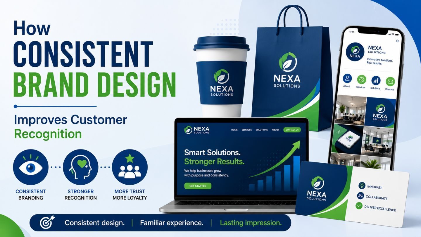
Recognition is worth more than attention, and it’s built through repetition most businesses never commit to. The brands you’d identify from a color alone, or from a shape in the corner of your eye, earned that by looking the same for years while everyone else was redesigning. Consistency feels boring from the inside and does enormous work from the outside. This blog covers why visual repetition builds recognition, what actually needs to stay fixed, where the flexibility lives, and why teams abandon consistency right before it pays off.
Key Takeaways
- Recognition is built through repetition, not novelty.
- Color and typography carry more recognition weight than logos.
- Consistency reduces the effort required to notice and remember you.
- Internal boredom is the main cause of premature rebrands.
- A design system makes consistency achievable rather than aspirational.
Why Repetition Builds Recognition
Human memory works through exposure. The more consistently something appears in the same form, the less mental effort it takes to identify, and the more familiar it feels. Familiarity translates into a quiet preference; people trust what they recognize, largely without deciding to. That’s the entire mechanism, and it only works if the thing being repeated stays the same.
The implication is uncomfortable for creative teams. The value comes from doing the same thing repeatedly, not from doing something new. Every redesign resets the accumulation. A brand that changes its palette every eighteen months is starting from scratch every eighteen months, no matter how much better each version looks. Understanding the importance of graphic design in digital marketing means accepting that consistency is a strategy, not a lack of one.
Color Does More Than Logos
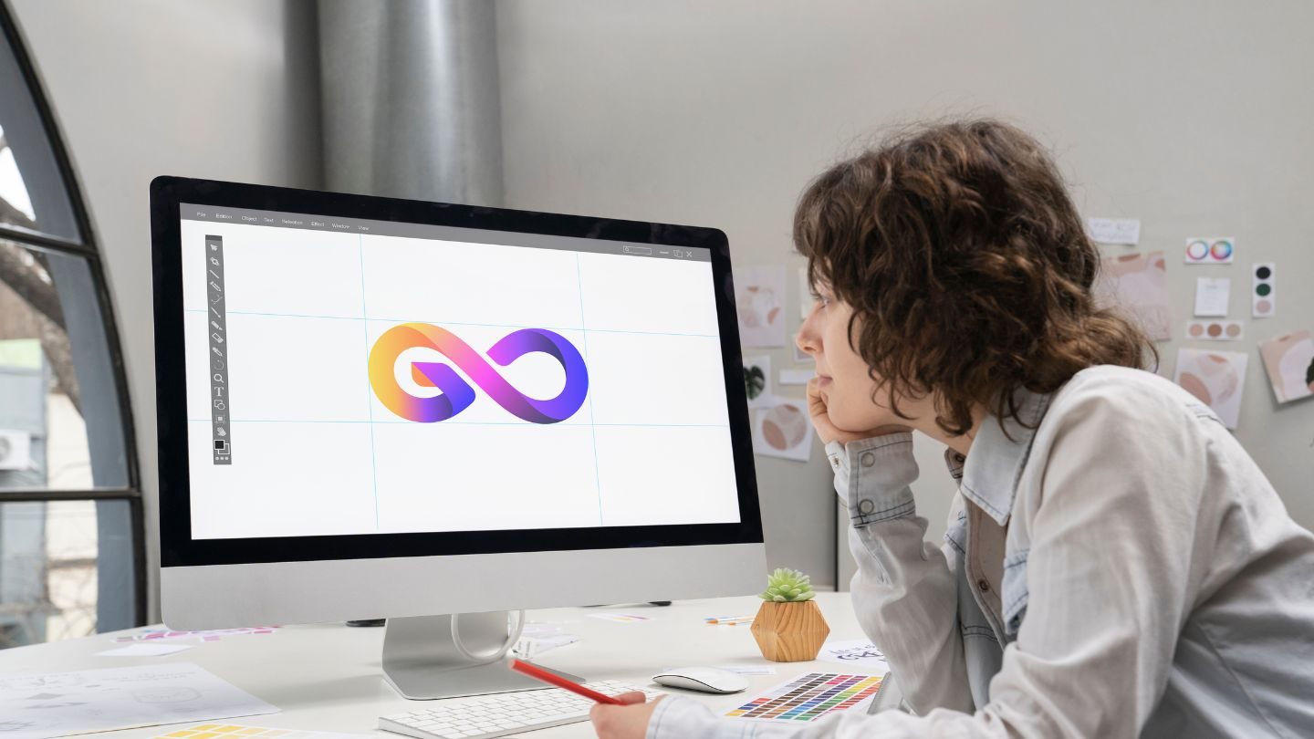
Businesses obsess over their logo and treat color as decoration, which inverts the actual weight of each. A logo requires someone to look directly at it. Color registers peripherally, at a glance, from across a room, in a feed being scrolled at speed. It’s doing the recognition work in most of the situations that matter.
This is why a tightly held palette outperforms a beautiful mark applied inconsistently. If your posts, ads, site, and packaging all share the same distinctive colors, people identify you before they read anything. If your palette shifts by campaign, you’re relying on the logo alone, and the logo is the last thing anyone notices. Color is the cheapest recognition asset available and the most casually abandoned.
Typography Is the Quiet Signal
Consistent type does the same work more subtly. A distinctive typeface used everywhere becomes recognizable even when nothing else is visible, which is why serious brands rarely change theirs.
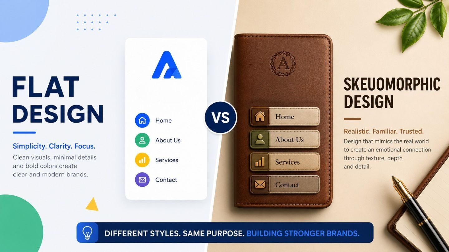
Read More: Flat Design vs Skeuomorphic Design in Modern Branding
What Needs to Stay Fixed
Not everything has to be locked down, and pretending otherwise makes a system nobody follows. The non-negotiables are narrow: your palette, your typefaces, your logo usage rules, and your photographic or illustrative approach. Those four carry the recognition load.
Everything else can flex. Layouts vary by format. Tone shifts with context. Campaign concepts change entirely. The distinction is between the things that make you identifiable and the things that make each piece work for its purpose. Businesses that lock down layout and let color drift have it exactly backward, and the result is work that looks rigid while remaining unrecognizable. Getting this right is part of why consistent brand design produces real business benefits rather than just a tidier folder of assets.
Why Teams Abandon It Too Early
Here’s the trap. You look at your brand every single day. By month six, you’re bored with it. By month twelve, you’re convinced it’s dated. Meanwhile, your customer has seen it perhaps four times and hasn’t formed any impression at all, let alone fatigue.
That asymmetry drives more bad rebrands than any strategic reason. Internal boredom gets rationalized as "it’s feeling tired" or "we need to modernize," and the accumulated recognition gets thrown away to solve a problem only the team has. The honest question before any refresh is whether customers are confused or whether the marketing team is restless, and the answer is usually the second one.
Consistency Without a System Is a Wish
Telling people to stay on brand doesn’t work because most inconsistency isn’t defiance; it’s improvisation under deadline. Someone needs a graphic, can’t find the right color code, picks something close, and ships it. Multiply that by every person making anything, and the brand dissolves through a thousand small approximations. Choosing the right tooling matters here too, which is where the Canva versus Adobe question stops being academic.
A system prevents that by making the right choice the easy choice. Documented hex values, defined type scales, ready templates, and an asset library people can actually find. Not a fifty-page PDF nobody opens, but practical tools that remove the moment of improvisation. Knowing why specialization matters across types of graphic design helps here, because the person building the system and the person using it under pressure need different things from it.
When Changing Actually Makes Sense
None of this is an argument that brands should never change. The legitimate reasons exist, and they’re specific: the business genuinely does something different now, the identity was built for a market you’ve outgrown, there’s a real conflict with another brand, or the design has an actual problem, illegible at small sizes, failing contrast, unusable in the formats that matter.
The distinction is whether the change solves a problem your customers have or one your team has. A refresh driven by evidence, customers misidentifying you, and the mark failing in contexts you now need is worth the reset. A refresh driven by a new marketing director wanting to make their mark is expensive theatre. The honest question is whether you could explain the reason to a customer and have them agree it mattered.
What Recognition Is Actually Worth
The returns show up in places that don’t obviously connect to design. Lower cost per acquisition, because people recognize you faster and hesitate less. Higher engagement on content, because your posts are identified as yours before they’re read. Shorter sales cycles, because familiarity does some of the trust-building before anyone talks.
None of that appears in a design report, which is why the value gets underestimated in exactly the meetings where redesign budgets are approved. The brands with the strongest recognition rarely have the most interesting design; they have the most repeated design. That’s an unglamorous truth, and it’s the one that compounds. Consistency is also what makes a brand mention recognisable when it appears somewhere you do not control.
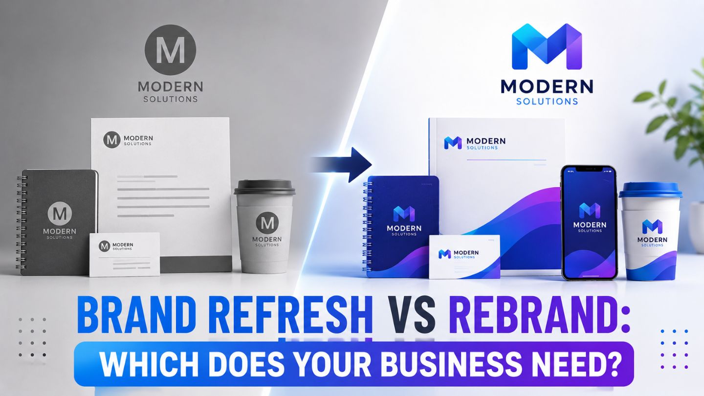
Refresh Versus Rebrand
There’s a large gap between updating and starting over, and businesses routinely conflate them. A refresh keeps the recognition assets, the palette, the type, and the core mark and modernizes the execution around them. A rebrand throws out the accumulated recognition and begins again.
Refreshes are usually right. Rebrands are occasionally necessary, after a genuine change of business, a merger, or a positioning that no longer matches what you do. The question worth asking is whether customers would notice the problem you’re solving. If the answer is no, you want a refresh, and calling it a rebrand is how the budget triples.
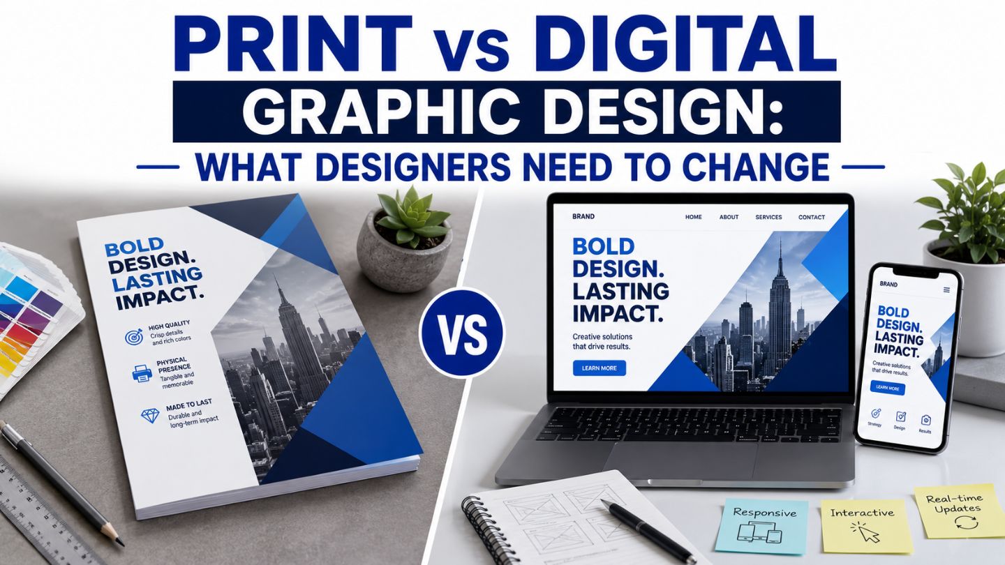
Consistency Across Channels: People Forget
The website gets attention because everyone looks at it. The email templates, the invoices, the proposal deck, the vehicle livery, the signage, the presentation someone in sales built themselves- these drift, and they’re often the touchpoints customers see most often.
An audit worth doing: collect every asset a customer might encounter over a year and lay them out together. The gaps are usually startling, and they’re usually in the places nobody thought of as design. Fixing the invoice template is unglamorous work that quietly does more for recognition than another homepage revision.
Read More: What Is Marketing & Advertising Graphic Design?
Distinctiveness Beats Trendiness
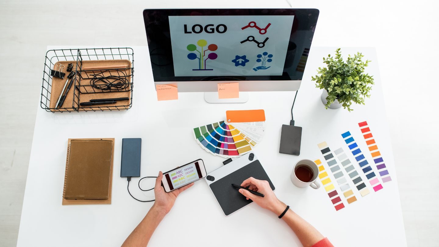
The pull toward whatever looks current is strong, and it’s the enemy of recognition. Adopting the design language everyone else adopted this year means looking exactly like your competitors, which is the opposite of the goal, and it means looking dated in three years when the trend passes.
The brands with the strongest recognition frequently look slightly out of step because they chose something distinctive and then held it while fashion moved around them. That takes nerve, particularly when someone on the team keeps sending links to competitors who just redesigned. Being recognizable and being current are different objectives, and only one of them compounds.
Getting Buy-In for Holding Steady
The hardest part of consistency is internal, and it’s usually a conversation rather than a design problem. Someone senior is bored, a new hire has opinions, a competitor redesigned, and now everyone’s nervous. None of those are customer problems, and all of them generate pressure to change.
The argument that works is showing the cost. Recognition took years to build, and a rebrand resets it, so the question isn’t whether new work would look good; it’s whether it’s worth starting over. Framed that way, most refresh conversations resolve toward keeping the assets that carry recognition and updating everything else, which is usually the right answer anyway.
Staying Recognizable Long Enough to Matter
Consistent brand design isn’t a creative constraint; it’s the mechanism by which recognition gets built at all. Color and typography carry more of that weight than the logo everyone argues about. The system matters more than the guidelines because people follow what’s easy rather than what’s documented. And the biggest threat to your visual identity isn’t a competitor; it’s your own team getting bored with it years before your customers have properly noticed it. Hold the line long enough, and recognition does work that no campaign can buy.
At The Ocean Marketing, we build graphic design services around identities that stay recognizable rather than ones that need replacing every other year. Whether you need a design system your team will actually use, an audit of where your brand has drifted, or a free SEO audit to see how your site performs overall, our team can help. Contact us and let’s build something worth repeating.