
You've probably felt the difference without naming it. A button that responds the instant you touch it, a form field that confirms your entry with a small tick, a menu that slides rather than snaps. None of these are features exactly, yet a site without them feels lifeless and slightly untrustworthy. These small responses are microinteractions, and they carry more weight than their size suggests. This blog covers what they are, why they shape how people judge your site, where to use them, and how to avoid overdoing it.
Key Takeaways
- Micro interactions are small visual responses to user actions.
- They confirm actions, reduce uncertainty, and make interfaces feel responsive.
- Well-placed feedback lowers form abandonment and support requests.
- Overused animation slows perceived speed and irritates repeat visitors.
- Purpose should drive every micro interaction, not decoration.
What Counts as a Micro Interaction
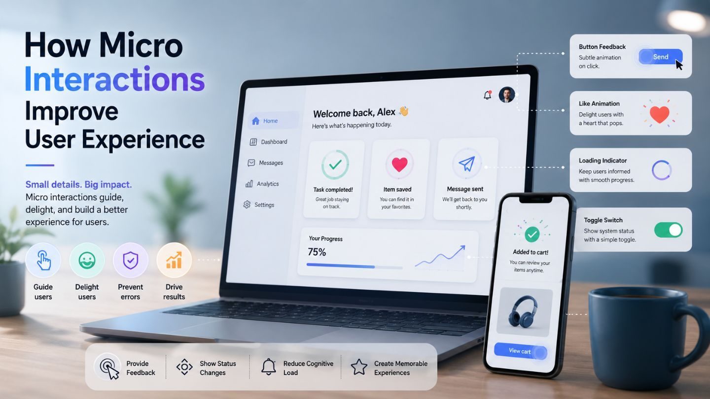
A micro interaction is any small, contained response to something a user does. Hovering over a link and watching it underline. Tapping submit and seeing the button shift into a loading state. A field turning green when the email format checks out. A cart icon nudges when an item is added. Each is trivial on its own, and together they form the texture of how a site feels to use.
The reason they matter comes down to feedback. Every action a person takes online carries a small question: Did that work? Without a response, the brain fills the gap with doubt, and doubt produces the double-click, the second form submission, the abandoned checkout. A micro interaction answers that question before it's consciously asked, which is why users notice their absence far more than their presence.
Why Small Feedback Changes User Behavior
Interfaces that respond immediately feel faster than ones that don't, even when the underlying speed is identical. A button that acknowledges a tap within a hundred milliseconds registers as instant, while one that sits inert for the same duration feels broken. You're not making the server quicker; you're removing the ambiguity that makes waiting feel long.
That perception spills into trust. People read responsiveness as competence, fairly or not. A site where hovering does nothing and clicking produces silence reads as neglected, and a neglected site raises questions about whether the business behind it is any different. This connects directly to the importance of user experience in web design, where the smallest details often carry the strongest impressions.
Where They Earn Their Place
Forms are the obvious win. Inline validation that confirms a correct entry or flags a problem before submission, rather than after, cuts abandonment noticeably. Nobody enjoys filling six fields, hitting submit, and being sent back to fix something they could have caught two minutes earlier. A quiet tick beside a valid field prevents that entire frustration.
Navigation benefits too. Hover states that show what's clickable, active indicators that show where you are, and smooth transitions that maintain a sense of place rather than teleporting people around. Loading states matter enormously; a skeleton screen or progress indicator keeps someone waiting when a blank page would send them to the back button. These details compound across a session in ways analytics rarely attribute correctly.
Confirmation Beats Explanation
When a user completes something, show it. A saved state, a checkmark, a brief toast message. Users who don't see confirmation will either repeat the action or contact support, and both cost more than the animation would have.
The Line Between Polish and Noise
Here's where teams overcorrect. Once you understand micro interactions, the temptation is to animate everything, and that's how you make a site tiring. Elements bouncing into view on scroll, buttons that wobble, transitions long enough to notice. Fun the first time, annoying by the fifth, and actively obstructive for someone who visits daily and just wants to get something done.
The test is simple: does this animation communicate something, or is it there because it looked good in a demo? Confirming an action communicates. Announcing a card's arrival on screen does not. Duration matters as much as presence; anything past three hundred milliseconds starts feeling sluggish, and users will perceive your fast site as slow because you made them wait for decoration. Poorly judged effects show up in common web design mistakes that small businesses make more often than most teams realize.
Read More: How to Use Animation in Web Design Without Hurting SEO
Performance and Accessibility Can't Be Afterthoughts

Animation has a cost. Effects that trigger layout recalculation cause visible stutter on mid-range phones, which is most of your traffic. Sticking to transform and opacity keeps things smooth because those run on the compositor without forcing the browser to re-measure the page. It's a small technical constraint with a large practical impact.
Accessibility deserves equal attention. Some users experience motion sickness from movement, and the prefers-reduced-motion media query exists so you can respect that. Feedback should never rely on color alone; pair it with an icon or text so it works for colorblind users and screen readers. Guidance on using animation in web design without hurting SEO covers the performance side of this well.
How to Judge Whether They're Working
Micro-interactions rarely show up as a clean line in a dashboard, but their effects do. Form completion rate, field-level drop-off, repeat submissions, support tickets asking whether something was saved. If validation feedback goes in and abandonment drops, that's your answer. If a loading indicator appears and bounces on that step, the same conclusion.
Session recordings tell you more than numbers here. Watching someone click a button four times because nothing appeared to happen is more persuasive than any chart. Those recordings surface the gaps where users are uncertain, and uncertainty is exactly what micro-interactions exist to remove. Fix the ones you can see people struggling with before adding polish nobody asked for.
Loading States Deserve Their Own Attention
The moment between an action and a result is where most sites give up. A button that shows nothing while a request processes leaves the user in exactly the ambiguity micro interactions exist to remove, and they respond predictably: they click again, submit twice, or assume it's broken and leave.
A skeleton screen showing where content will appear, a spinner on the button that was pressed, and a progress bar for anything genuinely slow. Each communicates that the system heard you and is working. It doesn't make the wait shorter, and it reliably makes it feel shorter, which is the entire point. Sites that get everything else right and skip this still feel broken, because the gap is where the doubt lives.
Error States Are Where Trust Is Won or Lost
Nobody plans for the error state, which is why so many of them are hostile. A form that clears everything you typed after a validation failure, an error message that says something went wrong without saying what, a red border with no explanation. Each of those is a micro-interaction, just a badly designed one, and they do more damage than the absence of feedback would.
Good error handling is specific and adjacent. Tell the person what's wrong, next to the field it's wrong in, in a language a human wrote. Preserve what they already entered. Say how to fix it. This costs nothing beyond attention, and it's the difference between a user who corrects the error and one who abandons the form, which is usually the more expensive of the two outcomes.
Consistency Matters More Than Cleverness
A site where every interactive element behaves differently teaches users nothing. Buttons that respond one way in the header and another way in the footer, hover states that appear on some links and not others, transitions with wildly different timings. Each individually is fine, and collectively they mean nobody builds an intuition for how your interface works.
The fix is a small, boring set of rules applied everywhere. One transition duration. One hover treatment. One loading pattern. It sounds like it would produce something flat, and in practice it produces something that feels solid, because users stop having to relearn the interface on every page. Predictability isn't the opposite of good design; it's most of it.
Read More: Visual Hierarchy in Web Design: How to Guide Users Without Text
Consistency Is What Makes Them Feel Intentional
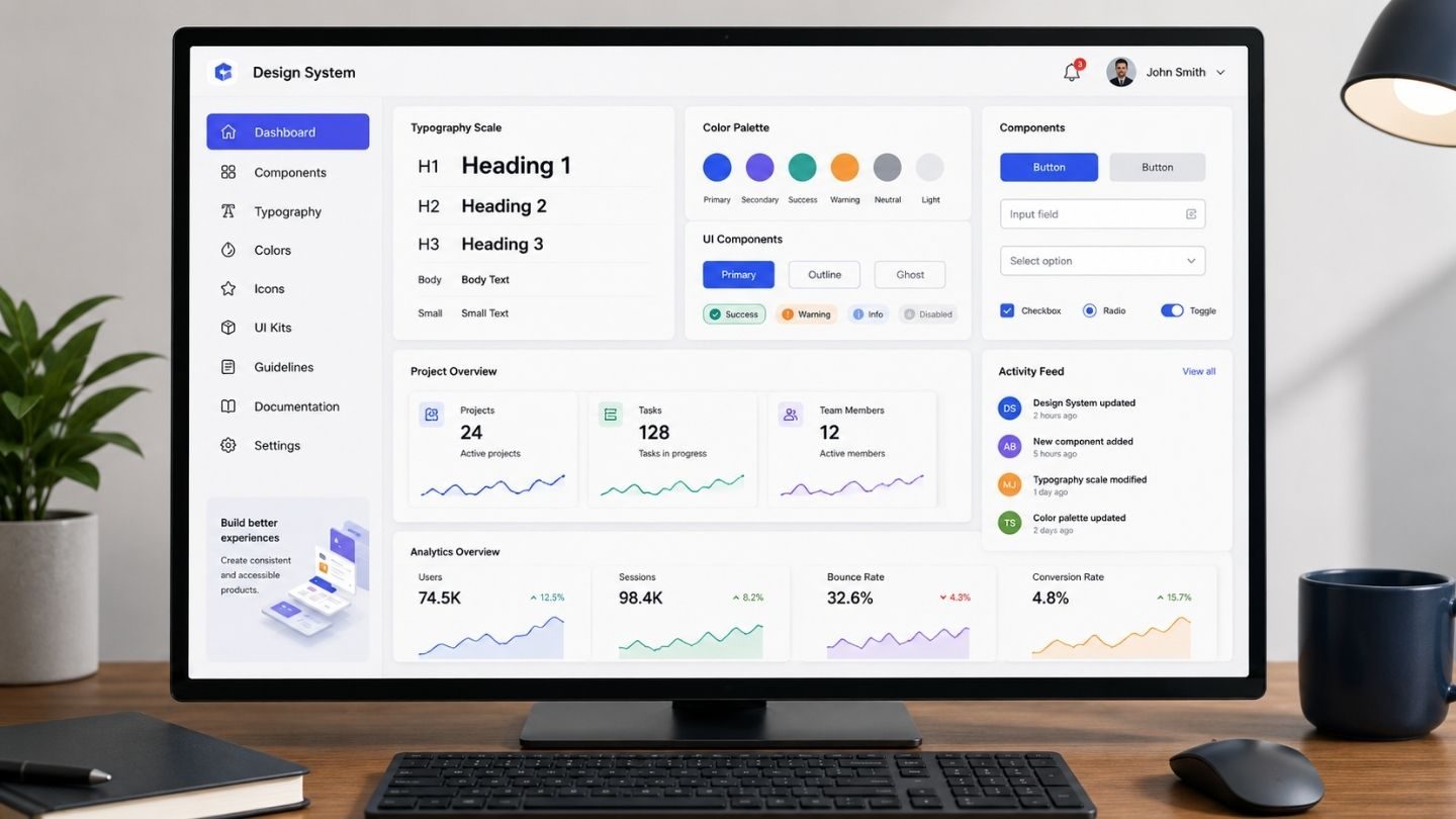
A site where the button responds one way on the pricing page and another way in the footer doesn't feel polished; it feels assembled by different people on different days, which it usually was. Micro interactions only read as deliberate when they behave the same everywhere, because users build expectations fast and notice inconsistency long before they notice craft.
That argues for defining the behavior once rather than deciding it per component. One transition duration, one easing curve, one way hover states resolve, one pattern for confirming an action. Written down, it takes an afternoon and removes a hundred small decisions later. Left to improvisation, every new page adds another variation, and the cumulative effect is an interface that feels slightly untrustworthy without anyone being able to say why.
Getting the Details Right
Micro interactions aren't decoration; they're communication. Done well, they answer the small questions users have at every step, confirm that actions landed, and make an interface feel responsive and considered. Done carelessly, they slow things down and get in the way. The difference comes from asking what each one is for, keeping them quick, respecting users who prefer less motion, and testing against real behavior rather than assuming polish equals improvement.
At The Ocean Marketing, we build sites where the small details support the experience rather than distract from it. Whether you're rethinking your website design, fixing friction in a form that isn't converting, or want a free SEO audit to see how your site performs overall, our team is happy to take a look. Contact us, and we'll help you work out where the experience is losing people.