

AI tools can now produce working interfaces from a description, which has shifted the conversation from whether they are usable to what they should actually be used for. The honest answer is that they are excellent at some parts of design work and unreliable at others, and the gap between those two is where most of the practical guidance lives. This blog covers what AI-assisted design genuinely does well, where human judgment remains necessary, and how the workflow is changing for teams building sites.
Key Takeaways
- AI tools compress exploration and prototyping dramatically.
- Strategic decisions about structure and priority still need a human.
- Generated interfaces trend toward familiar patterns rather than differentiated ones.
- Accessibility and performance need verification, not assumption.
- The workflow shifts toward specification and review rather than production.
What These Tools Are Genuinely Good At
The clearest benefit is exploration speed. Producing five structurally different versions of a page to react to, rather than one carefully built comp, changes how early design decisions get made. Reacting to something concrete is far easier than evaluating a description, and getting to that concrete stage now takes minutes.
They are also reliable at the mechanical baseline: responsive behavior that works, sensible default spacing, markup that is not broken. That baseline used to consume real time and now largely comes for free, which raises the floor even where it does not raise the ceiling, much like the shift described in conversion-focused homepage design strategies.
Content Still Has to Be Written
A generated layout arrives with placeholder copy, and replacing it with real content is where most of the actual work sits. A well-structured page carrying vague, generic writing converts no better than a poorly structured one, and the structure gets credited or blamed either way.
This is worth planning for explicitly, since the speed of producing the interface can create an impression that the page is nearly finished when the substantive part has not started. The layout is scaffolding; the argument it holds is what does the persuading. Replacing placeholder copy well is its own discipline, closer to editing AI content so it ranks and converts than to writing from scratch.
Where Generated Output Falls Short
The most consistent limitation is sameness. These tools draw on common patterns, which means output converges on interfaces that look competent and familiar. For a business competing on being findable and functional, that is fine; for one that needs to look distinct in a crowded market, it quietly removes the thing that would have differentiated it.
The deeper gap is strategic. A tool can produce a pricing page; it cannot decide which three plans reduce hesitation for your specific buyer, or which objection needs answering above the fold. Those decisions come from knowing the customer, and they are what separates a page that looks right from one that converts. Reviewing what custom design offers over templates frames the same trade-off from a different angle.
Where Brand Identity Gets Lost

Generated output defaults to sensible, conventional choices, which means anything distinctive about your brand has to be supplied deliberately. Color, typography, imagery approach, and tone of interface copy all drift toward generic unless they are specified as constraints rather than left open.
The practical fix is providing the design system as input rather than expecting it to be inferred. Documented tokens, defined type scale, and a stated imagery approach give the tool something concrete to work within, and the output stops looking like everyone else's. Holding those choices steady over time is what makes consistent brand design pay off in recognition.
Accessibility and Performance Need Checking
Generated interfaces frequently pass a casual look and fail specific checks: contrast ratios that fall below standard, tap targets too small to hit reliably, missing labels on form fields, or motion with no reduced-motion handling. None of these are visible in a screenshot review.
The same applies to performance. Output that renders correctly can still carry heavy assets or layout behavior that stutters on a mid-range phone. Verifying rather than assuming is the whole discipline here, and it overlaps with the accessibility considerations that apply to any visual work.
Test on a Real Phone, Not a Preview
Emulated mobile views hide tap accuracy, reach, and genuine load behavior. Two minutes on an actual device catches problems a desktop review never will.
Read More: Mobile SEO: Why It Matters More Than Ever in 2025
Where Search Considerations Enter
A generated interface can be visually fine and structurally unhelpful for search: headings used for styling rather than hierarchy, content loaded in ways crawlers handle poorly, or a page structure that buries the answer someone came for. These are not visible design faults, and they affect visibility directly.
This is where SEO has to sit inside the design process rather than arriving afterward. Heading hierarchy that reflects actual document structure, content present without depending on interaction, and clear internal paths are design decisions as much as technical ones, and retrofitting them later is considerably more expensive than specifying them upfront.
Read More: How to Use Animation in Web Design Without Hurting SEO
How the Workflow Actually Changes
The shift is from producing to specifying and reviewing. Describing what a page must accomplish, for whom, with which constraints, becomes the skill that determines output quality, because a vague prompt produces vague results at speed. That is closer to writing a brief than to visual craft.
Review becomes the other half. Someone still has to judge whether the result serves the business goal, holds up on a real device, meets accessibility standards, and looks like your brand rather than a generic one. Teams that removed that role entirely tend to discover the gap later, usually in a page that was quietly underperforming for months.
What Handoff Looks Like Now
When production is fast, the bottleneck moves to review and integration. Generated markup still has to fit an existing codebase, respect established components, and survive whatever content management system runs the site, none of which the generation step accounts for.
Teams that plan for this treat output as a starting structure rather than a finished implementation, and budget time for the integration work explicitly. Teams that do not tend to discover the gap during a deadline, which is the expensive version of learning it.
Matching the Approach to the Stakes
The sensible split is by consequence. Internal tools, early prototypes, and low-stakes pages can lean heavily on generated output with light review. Homepage, primary service pages, pricing, and anything a prospect sees while deciding whether to trust you deserve real strategic input and thorough checking.
This is also worth revisiting periodically rather than deciding once, since the tools keep improving and a judgment made eighteen months ago may no longer hold. The principle that stays stable is that baseline competence gets cheaper while genuine differentiation does not, which is why website design work concentrates increasingly on the decisions rather than the production.
Keeping Skills That Still Matter
There is a real risk in a team that stops practicing the judgment it now delegates. Understanding why a layout works, how hierarchy directs attention, and what makes a page convert is what allows you to evaluate generated output at all, and it atrophies if nobody exercises it.
That argues for keeping design review substantive rather than cursory, and for continuing to work through the reasoning on important pages rather than accepting the first plausible result. The tool produces options; the judgment about which one serves the business is the part worth protecting.
Documenting What You Decided and Why
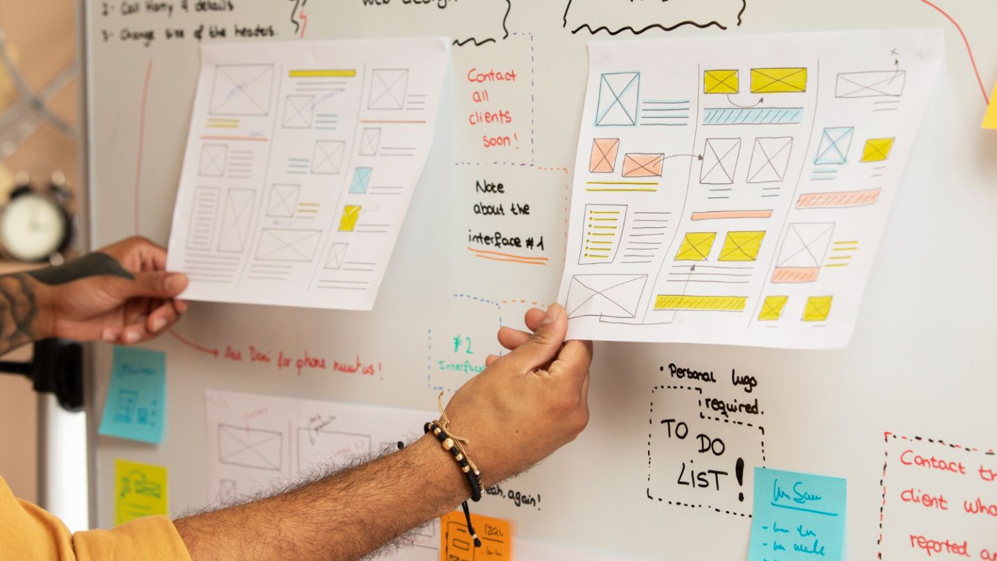
Fast iteration produces a lot of discarded options and very little record of the reasoning behind the surviving one. Six months later nobody remembers why the pricing page is structured as it is, which makes every subsequent change an argument from taste rather than from a prior decision.
A brief note attached to significant pages- what problem the layout solves and what was tried- costs minutes and preserves the reasoning. It also makes it possible to tell whether a later change is an improvement or a reversal of something that was decided deliberately.
Using the Tools Without Outsourcing the Judgment
AI-assisted design is a real improvement to how interfaces get built, particularly for exploration, prototyping, and clearing the mechanical baseline. What it does not supply is the decision about what the page should do, who it is for, and what would make it work better than a competent generic version. Specify carefully, verify accessibility and performance on real devices, keep search structure in the design conversation rather than after it, and reserve genuine strategic attention for the pages where the decision actually happens.
At The Ocean Marketing, we combine SEO and website design with efficient production and strategic thinking that a generated layout cannot supply on its own. Whether you are considering an AI-assisted build, need your output properly reviewed before it ships, or want a free SEO audit to see how your current site performs, our team can help. Contact us and let's work out what your site actually needs to accomplish.