


Analytics tells you that people left. It rarely tells you why. Heatmaps close that gap by showing where visitors clicked, how far they scrolled, and where their attention stalled, which turns vague underperformance into something you can actually see. The catch is that heatmaps are easy to misread, and plenty of teams redesign pages based on patterns that were noise. This blog outlines what each heatmap type reveals, the design decisions they genuinely improve, and the interpretation mistakes that lead people astray.
Key Takeaways
- Heatmaps show behavior that analytics numbers cannot explain.
- Click, scroll, and move to map each answer to different questions.
- Low sample sizes produce confident-looking but meaningless patterns.
- Rage clicks and dead clicks reveal broken expectations fast.
- Heatmaps generate hypotheses; testing confirms them.
What Heatmaps Show That Analytics Can’t
A bounce rate of seventy percent is a fact without a cause. It could mean the page loaded slowly, the headline promised the wrong thing, the call to action sat below where anyone scrolled, or the whole offer was irrelevant. Analytics gives you the symptom, and teams then argue about the diagnosis based on preference rather than evidence.
Heatmaps supply the evidence. If the scroll map shows eighty percent of visitors never reaching your primary button, the debate ends. If the click map shows people repeatedly tapping a graphic that isn’t a link, you’ve found a broken expectation nobody reported. This is behavioral data rather than aggregate data, and it settles arguments that numbers alone keep alive indefinitely.
The Three Types and What Each Answers
Click maps show where people tap. Their real value is often in what they reveal about mistaken expectations, elements people try to click that do nothing, and the buttons you assumed were obvious that nobody touches. Both findings are actionable immediately.
Scroll maps show how far down the page attention survives, and they routinely humble teams who assumed their carefully written mid-page section was being read. Movement maps track cursor position, which correlates loosely with attention on the desktop and is worth treating with more caution than the other two. Each answers a different question, and using one to answer another is how misreadings start. Pairing this with an understanding of why users stop reading mid-page turns a scroll map from a curiosity into a fix list.
Rage Clicks Are the Fastest Win
Repeated rapid clicking on one element means someone expected something to happen, and it didn’t. That’s a bug or a broken affordance, and it’s usually fixable in an afternoon.
Read More: 12 Reasons Your Website Can Have a High Bounce Rate
Design Decisions Heatmaps Actually Improve
Placement is the obvious one. If your conversion element sits past the point where most visitors stop scrolling, moving it up is not a design opinion; it’s arithmetic. The same logic applies to key messaging, trust signals, and anything else that only works if it’s seen. That is why above-the-fold design decisions deserve evidence rather than instinct.
Navigation benefits too. Click maps reveal which menu items carry real load and which exist because someone insisted three years ago. Removing dead weight from navigation reduces cognitive load for everyone, and heatmaps give you the evidence to overrule the person defending their pet link. This connects naturally to visual hierarchy in web design, since heatmaps effectively show you whether your intended hierarchy is the one users perceive.
The Sample Size Trap
This is where most heatmap misuse happens. Run a map for two days on a page getting forty visitors, and you’ll get a beautiful, colorful, entirely meaningless picture. Human brains find patterns in noise reliably, and a heatmap presents noise in a format that looks authoritative.
As a rough floor, wait for a few thousand sessions before drawing conclusions, and more if your traffic is varied. Segment desktop and mobile separately, because combining them produces a map describing nobody. And be skeptical of any pattern that conveniently confirms what someone already wanted to do; that’s the one most likely to be wishful reading rather than data.
Reading Them Without Fooling Yourself
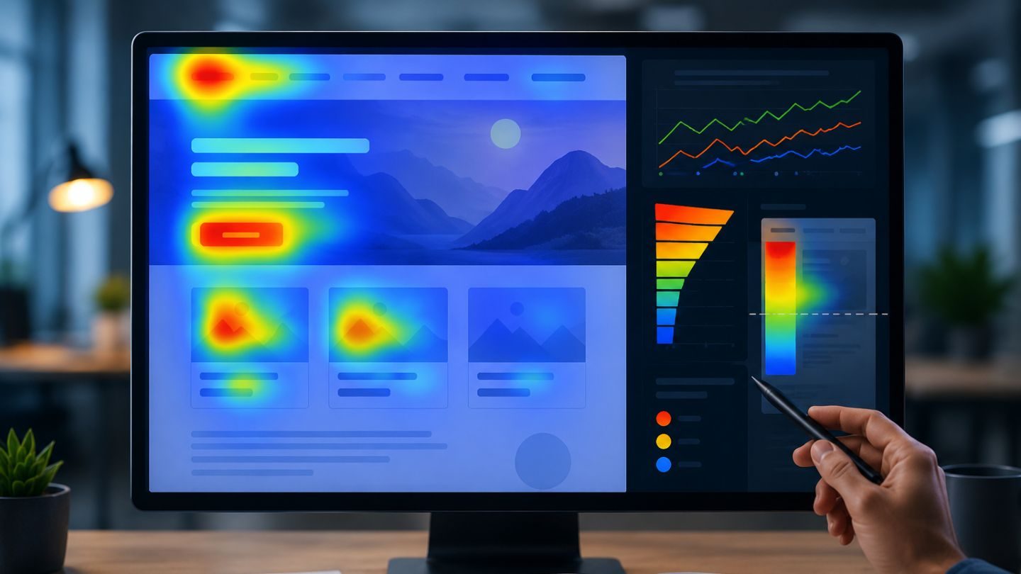
The most common interpretation error is confusing attention with interest. A hot spot on your hero image doesn’t mean people love it; it might mean they’re confused by it, or that it’s simply the largest thing on the page. Heat means eyes or cursors were there, not that anything good happened as a result.
The second error is treating heatmaps as answers rather than questions. A map showing nobody clicks your CTA tells you something is wrong, not what. Is it the copy, the color, the placement, or the fact that the offer doesn’t appeal? The map narrows the field, testing settles it. Teams that skip that second step end up redesigning based on a guess dressed up as evidence, which is how common web design mistakes get made with data on the slide deck.
Where They’re Worth Running First
Not every page deserves a heatmap. Start where the money is: your highest-traffic landing pages, your key conversion pages, and any page where the numbers say something is wrong, but nobody can agree why. Those three categories cover most of the value. Homepages earn a place on that list almost automatically, which makes conversion-focused homepage design a natural next step once the map is read.
Long pages benefit disproportionately because scroll depth is where assumptions fail hardest. So do pages that were designed by committee, where a heatmap frequently reveals that half the elements everyone fought over are being ignored entirely. Running maps on your entire site produces a lot of data and very few decisions, so be selective about where you look.
Segmentation Changes the Picture Entirely
A combined heatmap describes an average visitor who doesn’t exist. Desktop and mobile users behave so differently that merging them produces a map representing neither, and the conclusions drawn from it will be wrong for both groups simultaneously.
Split them at a minimum. Beyond device, the segments worth separating are new versus returning, since a first-time visitor explores while a repeat visitor goes straight to what they came for, and traffic source, because someone arriving from a paid ad has different expectations than someone who found you organically. Each segment tells a different story, and the aggregate hides all of them.
Session Recordings: Fill the Gaps
Heatmaps aggregate, which is their strength and their limitation. They show you that a pattern exists and tell you nothing about the individual experience behind it. Session recordings do the opposite: one person’s journey in full detail, with all the hesitation and backtracking that averages smooth away.
Used together, they’re considerably more useful than either alone. The heatmap points you at a problem area; the recordings show you what’s actually happening there. Watching five people struggle with the same form field is more persuasive to a stakeholder than any color gradient, and it usually explains the pattern the heatmap could only report.
When Heatmaps Tell You Nothing Useful
Some pages don’t benefit. A page with a single element and one obvious action produces a map with one hot spot, which you could have predicted. A page with very low traffic produces noise. A page nobody has complained about, that converts fine, is unlikely to reveal much worth changing.
Knowing when to stop looking matters as much as knowing where to look. Teams that install a heatmap tool and turn it on everywhere generate an enormous amount of data and very few decisions, then quietly stop opening it. Running maps selectively, on pages where something is actually wrong, keeps the tool useful rather than decorative.
Turning Findings Into Tests

A heatmap that changes nothing was entertainment. The step teams skip is converting an observation into a specific, testable change: not "the page needs work" but "moving the form above the fold should lift completions, and we’ll know in three weeks." That framing forces you to state what you expect, which is what makes the result meaningful.
It also protects against the redesign reflex. A map showing a problem in one section is an argument for changing that section, not for rebuilding the page. Teams that jump from a single finding to a full redesign lose the ability to attribute any improvement to anything, and they usually break things that were working fine.
Read More: SEO vs. CRO: Why They Should Always Go Together
Pair Them With the Question You’re Trying to Answer
Heatmaps get run speculatively more often than they should, switched on across a site in the hope something interesting appears. It usually doesn’t, or worse, something interesting-looking appears and someone acts on it. The maps that produce decisions are the ones deployed against a question that already exists.
Start from the problem. Conversions dropped on this page after a redesign, so compare scroll depth before and after. Sales says nobody finds the pricing, so check whether the link gets clicked. Support keeps answering the same question, so look at whether anyone reaches the section that answers it. A specific question turns a heatmap from a curiosity into evidence, and it takes a fraction of the time to interpret.
Seeing What Your Visitors Actually Do
Heatmaps earn their place by replacing opinion with observation. They show you where attention dies, which elements confuse people, and whether the thing you built the page around is even being seen. Used well, with adequate traffic, segmented properly, and treated as a source of hypotheses rather than verdicts, they make design decisions faster and less politically. Used carelessly, on thin data, read to confirm what someone already believed, they make bad decisions look evidence-based, which is worse than having no data at all.
At The Ocean Marketing, we use behavioral data to drive website design decisions rather than to decorate a report. Whether you want help interpreting what your heatmaps are showing, redesigning a page that isn’t converting, or starting with a free SEO audit to see how your site performs overall, our team is happy to help. Contact us and let’s find out what your visitors are really doing.