Skip to content
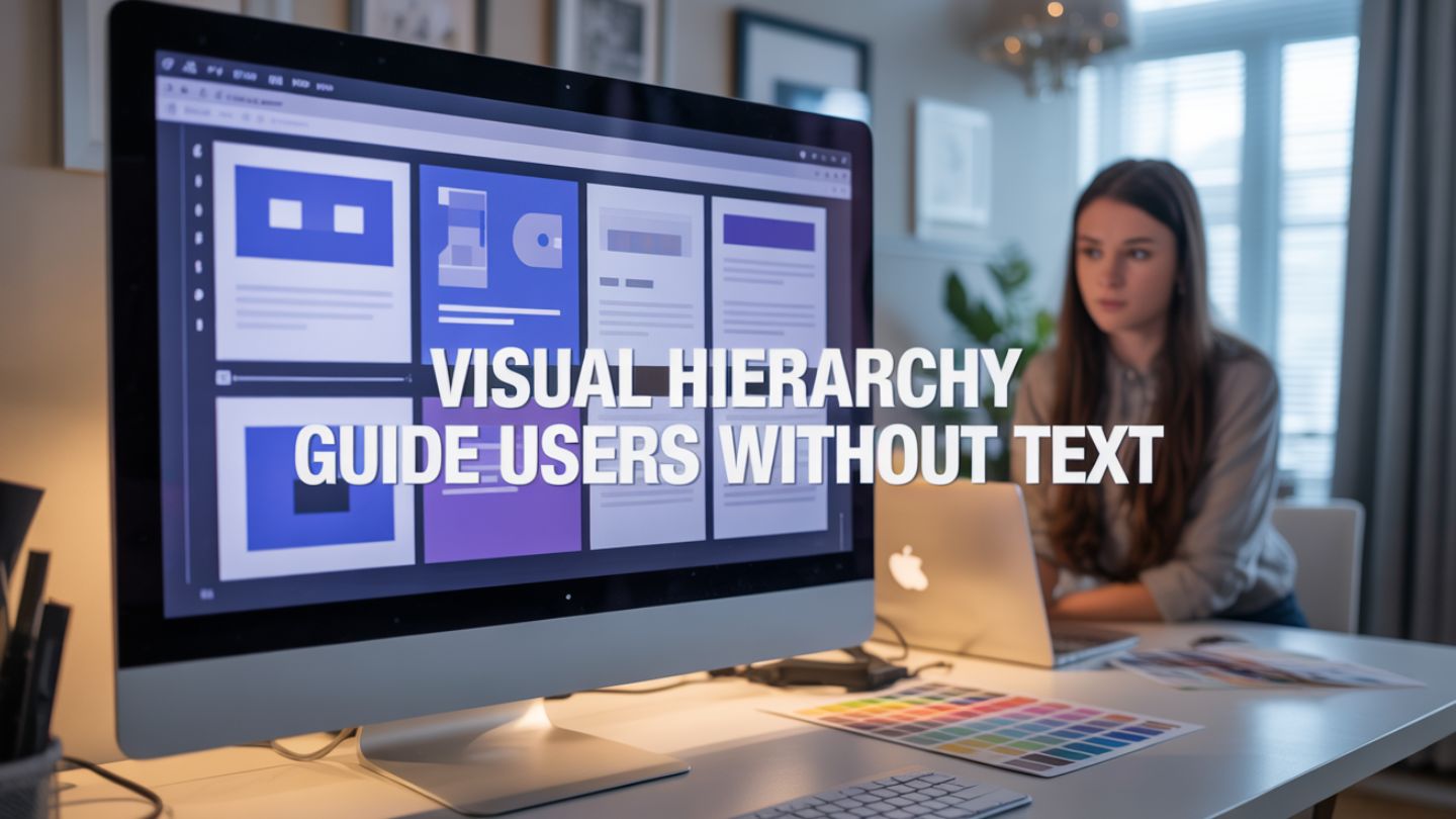
Have you ever landed on a website and instantly known exactly where to look? You didn’t need to read a paragraph of instructions or hunt for a “Start Here” button. Your eyes simply drifted to the most important element, then the next, and finally to the button that solved your problem.
That seamless experience isn’t an accident. It is the result of a powerful design principle called visual hierarchy. When we talk about web design, we often obsess over copy. We worry about headlines, value propositions, and detailed product descriptions. While words are crucial, the way you present them matters even more. Visual hierarchy is the subtle art of ranking design elements to show users what matters most. It guides visitors through your content in a specific order, influencing their decisions without them reading a single word.
This blog explores how you can harness the power of visual hierarchy to create intuitive, effective websites that convert visitors into customers.
Key Takeaways
- Visual hierarchy guides user attention naturally by prioritizing key elements like headlines, images, and CTAs, helping visitors understand your message instantly.
- Design tools like size, contrast, typography, and whitespace reduce cognitive load, making pages easier to scan and improving user experience across devices.
- Strong hierarchy improves conversions by leading users through a clear path, keeping them engaged longer, and making actions like clicks or sign-ups feel effortless.
Why Visual Hierarchy Matters More Than Ever
Users don’t read websites; they scan them. Studies consistently show that internet users spend mere seconds forming an impression of a webpage. If they can’t figure out what your site is about or what they should do next within that brief window, they bounce.
Visual hierarchy solves this problem by reducing cognitive load. Cognitive load refers to the amount of mental effort required to process information. A site with poor hierarchy forces the brain to work hard to sort through clutter. A site with a strong hierarchy does the heavy lifting for the user. It creates a clear path, making the experience feel effortless and professional.
This is exactly why quality web design matters for small businesses, especially when first impressions influence trust. When the structure feels clear and intentional, visitors are more likely to stay, engage, and take action rather than second-guess whether your business is professional or legitimate.
When you master visual hierarchy, you achieve three critical goals:
Improved User Experience (UX): Visitors feel comfortable and in control.
Higher Engagement: Users stay longer because the content is easy to digest.
Better Conversion Rates: You guide eyes directly to your Calls to Action (CTAs).
The Core Tools of Visual Hierarchy
You don’t need to be a professional artist to understand the tools of visual hierarchy. Most of these principles mimic how we interact with the physical world. By manipulating specific characteristics of your design elements, you can tell the user’s brain what to prioritize.
1. Size and Scale
The most obvious way to signify importance is through size. In the natural world, big things demand attention. On a screen, the largest element is what users see first.
This is why your main headline (H1) is usually the biggest text on the page. It tells the reader, “Start here. This is the main idea.” However, size isn’t just for text. A large hero image or a massive product shot dominates the visual field, signaling that the visual representation of the product is the priority.
Pro Tip: Use scale relatively. If everything is big, nothing is big. To make one element pop, the surrounding elements must be significantly smaller.
2. Color and Contrast
Color is a potent tool for drawing attention. Bright, bold colors stand out against muted backgrounds. This is why designers often use a “pop” color for buttons, like a bright orange “Subscribe” button on a navy blue background.
Contrast goes beyond just hue. It includes light versus dark and saturation versus desaturation. A high-contrast element acts like a beacon. If your website is mostly white and grey, a block of deep red will instantly pull the eye.
Use color sparingly to maintain hierarchy. If you use your boldest color for headlines, icons, borders, and buttons, the user won’t know which one is actionable. Reserve your strongest contrast for the primary action you want users to take.
3. Typography and Weight
Typography offers nuance. You can signal hierarchy not just by making text bigger, but by changing its weight (boldness), style (italics), or casing (UPPERCASE).
Think of a standard blog post layout. The title is large and bold. The subheaders are smaller but still bold. The body text is smaller and lighter. This structure allows a user to skim the article by reading only the bolded headers. They can understand the entire narrative arc of the page without reading the paragraphs.
Varying your fonts helps, too. Pairing a distinct serif font for headers with a clean sans-serif font for body text creates a visual separation that helps organize information.
4. Whitespace (Negative Space)
Whitespace is the unsung hero of web design. It is not just “empty” space; it is an active design element.
Surrounding an element with ample whitespace is like putting a spotlight on it. It isolates the object, telling the user that this item is special and distinct from the rest. A button crowded by text is easily missed. A button sitting alone in a pool of white space demands to be clicked.
Using whitespace effectively also prevents “clutter shock.” When information is packed too tightly, it feels overwhelming. Generous spacing makes content feel luxurious and easy to digest.
5. Texture and Style

Rich textures stand out against flat backgrounds. Complex styles draw the eye more than simple ones.
For example, imagine a flat, grey background. If you place a card on top of it that has a subtle drop shadow, that card appears to be “closer” to the user. This simulation of depth creates a hierarchy where the “closer” element is perceived as more important.
This principle is widely used in Material Design. Elements that float above the surface (like sticky headers or pop-up modals) are perceived as having a higher priority than the content sitting on the base layer.
Scanning Patterns: The F-Pattern and Z-Pattern
To implement visual hierarchy effectively, you need to understand how eyes naturally move across a screen. Two primary patterns dominate user behavior: the F-Pattern and the Z-Pattern.
The F-Pattern
This pattern is common on text-heavy pages like blogs or news sites.
Top Bar: Users scan the top of the page horizontally (the top bar of the F).
Second Scan: They move down a bit and scan across again, but usually for a shorter distance (the lower bar of the F).
Vertical Scan: Finally, they scan down the left side of the content in a vertical movement.
Design Implication: Place your most critical information and keywords along the top and the left-hand side. Don’t bury the lead on the right side of a text block.
The Z-Pattern
This pattern is typical for landing pages or designs with less text.
Top Left to Right: The eye starts top-left (logo) and moves to the top-right (navigation or CTA).
Diagonal: The eye cuts diagonally across the center of the page to the bottom-left.
Bottom Left to Right: The eye moves across the bottom to the final CTA.
Design Implication: Place your logo in the top left, your primary CTA in the top right, a hero image or value prop in the center, and a final “sign up” or “learn more” button at the bottom right.
Common Mistakes That Ruin Hierarchy
Even experienced designers can falter. Here are a few traps to avoid when structuring your site.
The “Everything is Important” Trap
When clients ask to “make the logo bigger,” “make the headline pop,” and “make the button huge” all at once, you end up with a screaming match. If every element is fighting for attention, the user gets overwhelmed and leaves. You must be ruthless in your prioritization. Decide on the one single thing that is most important per section.
This is also one of the common web design mistakes small businesses make, especially when trying to fit too much information into one screen. The goal isn’t to add more, it’s to guide attention with clarity.
Inconsistent Cues
If you use blue for clickable links in one section, don’t use blue for non-clickable headings in another. Consistency builds trust. When visual cues change randomly, users get confused and stop interacting with your elements.
Ignoring Mobile Hierarchy
A layout that has perfect hierarchy on a desktop monitor might fall apart on a smartphone. On mobile, the “Z-pattern” often collapses into a single vertical column. You need to ensure that as elements stack on top of each other, the order still makes logical sense. The headline must still appear before the image, and the image before the button.
Testing Your Hierarchy: The Squint Test
How do you know if your hierarchy is working? Try the “Squint Test.”
Pull up your design on your screen. Step back a few feet and squint your eyes until the details blur. You shouldn’t be able to read the text.
What stands out?
In a well-designed page, the blurry blobs that stand out should be your most important elements. You should see a big blob for the headline, a distinct blob for the main image, and a colorful blob for the CTA button. If the page looks like a uniform grey wall, your hierarchy is weak. You need to go back and adjust your contrast, scale, and spacing.
Final Thoughts
Visual hierarchy helps users navigate your website instantly by highlighting what matters most first. When elements like size, contrast, typography, spacing, and scanning patterns work together, your site becomes easier to understand, more engaging to browse, and far more likely to convert, without relying on visitors to read every word.
If your website feels cluttered, confusing, or fails to drive results, The Ocean Marketing can help with strategic website design that blends modern visuals with proven user behavior principles to improve both performance and growth. To strengthen your site even further, consider starting with a free SEO audit to uncover visibility issues and opportunities that may be holding your traffic and conversions back. Ready to transform your online presence? Let us help you build a site that guides visitors effortlessly to the checkout. Contact us today to discuss our professional website design services.