Skip to content
A website’s navigation plays a major role in shaping user experience and overall engagement. Sticky navigation has become a popular design feature because it keeps important menu options visible while users scroll through a page. While this approach can improve accessibility and convenience, it may also create usability challenges if not implemented properly. Businesses must understand both the advantages and limitations before adding sticky navigation to their websites. This blog outlines the key benefits and drawbacks of sticky navigation UX, how it impacts user behavior, and the best practices for creating a smooth and user-friendly browsing experience.
Key Takeaways
- Sticky navigation improves website accessibility and user convenience.
- It helps users move between pages without excessive scrolling.
- Proper sticky navigation can improve engagement and reduce frustration.
- Poorly designed sticky menus may negatively affect mobile experience.
- Sticky headers should never block important website content.
- Balanced navigation design supports better usability and readability.
- Website speed and responsiveness should always remain a priority.
- Sticky navigation works best when combined with thoughtful UX planning.
- Businesses should test sticky menus on different screen sizes.
- A well-structured navigation system can support SEO and conversions.
Understanding Sticky Navigation in Website UX
Sticky navigation refers to a website menu or header that remains fixed at the top or side of the screen while users scroll through content. Unlike traditional menus that disappear once a visitor scrolls down, sticky navigation stays visible, allowing instant access to important sections without returning to the top of the page. This design approach has become common across business websites, e-commerce platforms, blogs, and portfolio websites because it supports smoother browsing experiences.
Modern users often browse websites quickly and expect immediate access to navigation tools. Sticky menus reduce friction during navigation and make the browsing process feel more seamless, especially when the design supports the importance of user experience in web design through clear structure and easy access. However, the success of sticky navigation depends heavily on how well it is implemented. A cluttered or oversized sticky menu can distract users instead of helping them. Businesses must therefore balance functionality with visual simplicity to create a comfortable user experience.
Why Sticky Navigation Became Popular
The popularity of sticky navigation increased alongside mobile browsing trends and longer webpage formats. Many modern websites contain detailed landing pages, extensive service descriptions, and long-form blog content. Without a persistent navigation menu, users may feel lost while scrolling through large amounts of information. Sticky menus solve this issue by providing continuous access to key navigation options at all times.
Another reason sticky navigation became popular is its ability to guide visitors toward conversion-focused actions. Businesses often keep contact buttons, quote forms, booking options, or product categories visible throughout the browsing journey. This constant visibility encourages users to take action more easily. When implemented carefully, sticky navigation can support both usability and business goals without overwhelming the visitor experience.
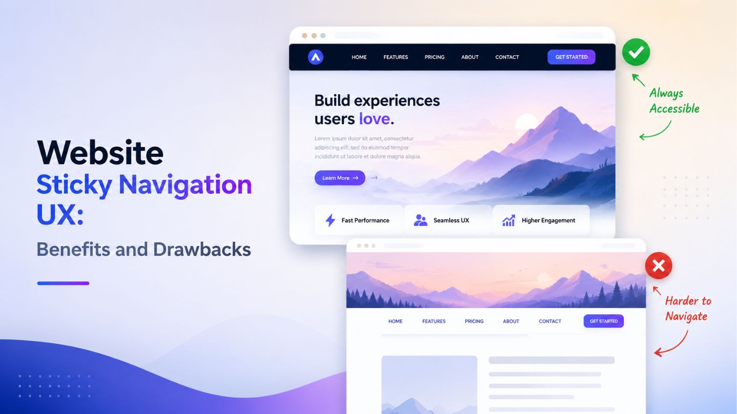
The Main Benefits of Sticky Navigation UX
One of the biggest advantages of sticky navigation is convenience. Visitors can quickly move between sections without repeatedly scrolling upward to locate the menu. This becomes especially helpful on long-form pages where users may otherwise feel disconnected from the website structure. Easier navigation contributes to smoother browsing sessions and helps users stay engaged with the content for longer periods.
Sticky navigation also supports better accessibility for users who prefer efficient browsing experiences. Keeping important links visible reduces effort and improves interaction speed. Many e-commerce websites use sticky navigation to maintain access to shopping carts, product categories, and search bars throughout the browsing process. This continuous accessibility can improve user satisfaction and potentially increase conversions when paired with intuitive design practices.
How Sticky Navigation Improves User Engagement
User engagement often improves when websites feel easier to navigate. Sticky menus help users explore additional pages without interrupting their browsing flow. Instead of abandoning a page after reading one section, visitors can immediately jump to another relevant area through the persistent navigation menu. This encourages deeper interaction across the website and increases the likelihood of users discovering more content or services.
Sticky navigation can also support content-heavy websites by making information easier to organize. Educational websites, blogs, and service pages often benefit from sticky table-of-content menus or floating navigation bars. These features help users locate relevant information faster while reducing frustration during long reading sessions, which also connects with visual hierarchy in web design because users should instantly understand where to look next. When users feel comfortable navigating a website, they are more likely to stay longer and interact with multiple pages.
Read More: The Importance Of User Experience (UX) In Web Design
The SEO Impact of Sticky Navigation

Although sticky navigation itself is not a direct ranking factor, it can influence user behavior metrics connected to search performance. Better navigation may encourage users to stay on the website longer, view additional pages, and interact more naturally with content. Positive engagement signals can contribute indirectly to stronger overall website performance and improved user satisfaction.
Search engines also prioritize mobile usability and accessibility, which means sticky navigation should always support responsive design practices and align with above-the-fold website design expectations for both users and search performance. Poorly optimized sticky menus that cover content or slow down loading speed can negatively affect user experience. Businesses should therefore ensure that sticky elements remain lightweight, responsive, and unobtrusive. A user-friendly design strategy that balances usability and performance often supports stronger long-term SEO outcomes.
Common Drawbacks of Sticky Navigation
Despite its advantages, sticky navigation can create usability problems when implemented incorrectly. One common issue is screen space reduction, especially on mobile devices. Large sticky headers may occupy too much visible space and make content feel compressed. This can frustrate users who prefer clean reading experiences without excessive interface elements constantly appearing on the screen.
Another drawback involves distraction. If sticky menus contain too many animations, bright colors, or oversized buttons, they may shift attention away from the actual content. Instead of improving navigation, the menu becomes visually overwhelming. Businesses sometimes prioritize promotional banners or aggressive call-to-action buttons within sticky headers, which can negatively affect readability and user comfort during browsing sessions.
Mobile Experience Challenges with Sticky Menus

Mobile responsiveness is one of the most important considerations when designing sticky navigation. Smaller screens leave limited space for both content and navigation elements. If the sticky header is too large, users may struggle to read the page comfortably. Poor spacing, oversized logos, or multiple menu rows can quickly damage the mobile browsing experience.
Touch interactions also play an important role in mobile sticky navigation design. Buttons must remain easy to tap without overlapping important content areas. Many websites simplify sticky navigation for mobile devices by reducing menu size, hiding secondary links, or using compact hamburger menus. Careful mobile optimization ensures that sticky navigation improves usability instead of becoming an obstacle for smartphone users.
Read More: Mobile SEO: Why It Matters More Than Ever
Best Practices for Effective Sticky Navigation
The most effective sticky navigation systems prioritize simplicity and usability. Menus should remain compact, visually clean, and easy to understand. Businesses should focus only on essential navigation links instead of overcrowding the header with unnecessary options. Minimal designs often create smoother browsing experiences and help visitors focus on both navigation and content naturally.
Performance optimization is equally important when implementing sticky elements. Heavy scripts, excessive animations, and large visual components can slow website loading times. Designers should test sticky navigation across different devices and browsers to ensure consistent functionality. Maintaining responsive behavior, readable spacing, and fast performance helps create a polished navigation experience that supports both user satisfaction and website efficiency.
When Sticky Navigation Works Best
Sticky navigation performs especially well on websites with long scrolling content. Blogs, ecommerce stores, service pages, and educational platforms often benefit from persistent navigation because users regularly move between sections while reading. Websites with multiple product categories or extensive service lists can also use sticky menus to simplify exploration and reduce navigation friction.
However, not every website requires sticky navigation. Simple websites with minimal content may function perfectly well with traditional menu systems. Businesses should evaluate user behavior, page length, and browsing goals before deciding whether sticky navigation is necessary. A thoughtful approach ensures that navigation supports the website structure instead of adding unnecessary interface complexity.
Finding the Right Balance in UX Design
Successful UX design always focuses on balance. Sticky navigation should support the user journey without dominating the visual experience. Designers must consider layout spacing, readability, responsiveness, and accessibility when implementing fixed menus. The goal is to create smoother interactions while allowing the website content to remain the primary focus.
Testing and user feedback are valuable during the design process. What works for one audience may not work for another. Businesses should monitor user behavior, mobile usability, and engagement patterns to determine whether sticky navigation genuinely improves the browsing experience. Continuous refinement helps create navigation systems that feel intuitive, professional, and aligned with modern user expectations.
Final Thoughts
Sticky navigation can significantly improve website usability when designed with balance and user experience in mind. It helps visitors navigate content more efficiently, encourages deeper engagement, and supports smoother browsing across long pages. However, oversized or poorly optimized sticky menus can negatively affect readability, mobile responsiveness, and overall accessibility. Businesses should focus on clean layouts, responsive functionality, and performance optimization to ensure sticky navigation enhances the browsing experience rather than distracting users from the content itself.
At The Ocean Marketing, we help businesses build user-focused digital experiences through professional website design and SEO solutions tailored for long-term growth and online visibility. Our team also offers an SEO audit to identify opportunities that can improve website performance, usability, and search rankings. Contact us today to create a website experience that keeps your visitors engaged and encourages meaningful conversions.