Skip to content
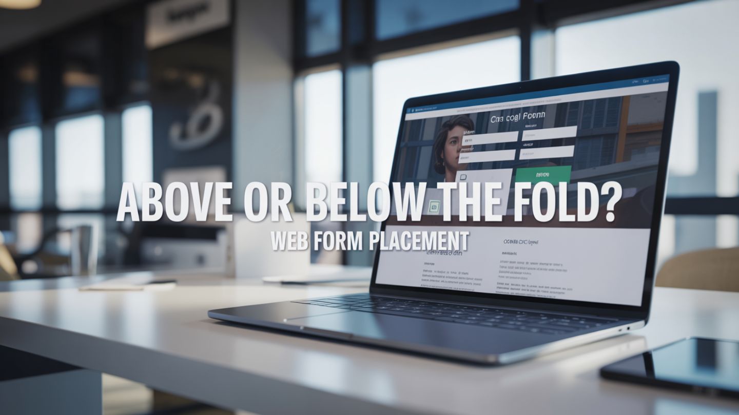
The placement of a web form on your landing page can feel like a high-stakes decision. Do you position it prominently “above the fold” for immediate visibility, or place it “below the fold” after you’ve had a chance to build value? It’s a classic debate in web design and digital marketing, with strong opinions on both sides. The truth is, there isn’t a single right answer. The optimal placement depends entirely on your goals, your product’s complexity, and your audience’s motivation.
This blog will explore the long-standing question of web form placement. We will break down the arguments for placing forms above and below the fold, look at when each approach works best, and provide you with a framework to make the best decision for your specific needs. Understanding these nuances can directly impact your conversion rates and lead generation success.
Key Takeaways
- There is no universal rule for form placement. Above-the-fold and below-the-fold strategies both work when they are aligned with user intent, offer complexity, and audience readiness to convert.
- High-intent traffic typically responds better to above-the-fold forms. When visitors arrive ready to take action, immediate visibility reduces friction and increases the likelihood of conversions.
- Complex or high-commitment offers benefit from below-the-fold placement. Building trust, explaining value, and addressing objections first make users more comfortable submitting their information.
Understanding “The Fold”
Before diving into the debate, let’s clarify what “the fold” means in a modern context. Historically, the term comes from newspapers, referring to the content visible on the top half of the front page when folded. In web design, it traditionally means the portion of a webpage visible without scrolling.
However, the “fold” is no longer a fixed line. With a vast array of screen sizes, from large desktop monitors to small smartphone screens, the visible area varies dramatically for each user. Instead of a rigid boundary, it’s more useful to think of “above the fold” as the user’s initial view of your page. It’s the first impression, the prime digital real estate that loads immediately. Placing a form here means it’s one of the very first things a visitor sees.
This decision also ties closely to the types of landing pages you’re building. A click-through landing page may focus heavily on messaging before guiding users forward, while a lead generation page often places the form front and center. Understanding the structure and purpose behind different landing page formats helps clarify whether your form should dominate the initial view or support a broader persuasive narrative.
The Case for Above-the-Fold Web Forms
Placing your form above the fold is the traditional, go-to strategy for many marketers, and for good reasons. The core principle is simple: maximize visibility to maximize conversions.
The Power of Immediacy
The biggest advantage of an above-the-fold form is that it cannot be missed. Visitors see the call to action and the means to complete it right away. This approach works exceptionally well in specific scenarios:
- High-Intent Traffic: If your visitors are arriving from a campaign that has already pre-sold them (like a “Download Our Free eBook” ad), they land on the page with a clear goal. They are actively looking for the form. Making them scroll for it introduces unnecessary friction and can lead to frustration and page abandonment.
- Simple and Low-Commitment Offers: For offers that require little consideration, like a newsletter signup or a simple contact form, an immediate prompt is effective. The user understands the value proposition instantly and doesn’t need extensive persuasion.
- Brand Recognition and Trust: If your brand is well-known and trusted, users may not need much convincing to hand over their information. They already understand who you are and what you offer.
This approach aligns with many proven tips to generate organic leads and boost conversions, particularly the emphasis on minimizing friction and making the next step obvious. When users already have intent, removing barriers and placing the form directly in view supports faster decision-making and higher conversion efficiency.
Potential Drawbacks
However, this approach isn’t a universal solution. An above-the-fold form can feel aggressive or demanding, especially if the visitor is new to your brand or the offer is complex. You are essentially asking for something before you have fully established value.
For high-commitment actions, like scheduling a demo for an expensive SaaS product, this can be premature and may scare away potential leads who need more information before they are ready to convert.
The Case for Below-the-Fold Web Forms

The argument for placing a form below the fold has gained significant traction, backed by both data and a deeper understanding of user psychology. This strategy prioritizes education and persuasion before asking for a commitment.
Building Value and Trust First
Placing a form below the fold gives you the space to tell a story. You can use the top half of your page to build a compelling narrative, outline benefits, showcase testimonials, and address potential objections. By the time the user scrolls down to the form, they have a comprehensive understanding of what you’re offering and why it’s valuable to them.
This is where visual hierarchy in web design, guiding users without text, becomes critical. Strategic use of spacing, contrast, headings, and layout can subtly lead visitors through your value proposition, naturally directing their attention toward the form when they are ready to convert. Even if the form sits below the fold, strong visual cues ensure it feels like the logical next step rather than a hidden element.
This approach is particularly effective for:
- Complex or High-Cost Products: When you’re asking for a significant commitment (a purchase, a detailed consultation, a free trial for a complex tool), you need to earn it. The space above the fold is your sales pitch. You build desire and confidence, so when the form appears, the user is motivated and ready.
- Lower-Intent or Top-of-Funnel Traffic: If visitors are coming from organic search or are in the early stages of their research, they are not ready to convert immediately. They are seeking information. Forcing a form on them right away is likely to fail. Guiding them through your value proposition first warms them up for the conversion.
- Long-Form Sales Pages: Detailed landing pages that explain features, benefits, and social proof in-depth naturally lead to a form at the end. The scroll itself becomes part of the qualification process; users who read all the way to the bottom are generally more interested and engaged.
The “Myth” of the Fold
Modern user behavior has also shifted. People scroll. It’s an intuitive and expected action on the web, especially on mobile devices, where scrolling is the primary mode of navigation. Worrying that users won’t see content below the fold is often an outdated concern.
The key is not whether they can see it, but whether your content gives them a reason to scroll down to it.
How to Choose the Right Web Form Placement

So, how do you decide? The best choice isn’t about following a trend but about a strategic decision based on your specific context. Ask yourself these questions:
- What is the user’s motivation?
Are they arriving with high intent, ready to act? Or are they in discovery mode, needing more information? High intent favors above-the-fold placement, while low intent favors below. - How complex is my offer?
Is it a simple newsletter signup or a request for a comprehensive software demo? The more complex and high-commitment the offer, the more you need to persuade first, which points to a below-the-fold form. - How much information is required?
A form asking only for an email address is a low barrier and can work well above the fold. A multi-field form asking for a name, company, job title, and phone number is a bigger ask that often requires more upfront value justification. - What does the data say?
The ultimate arbiter is your own audience. The best practice is to test both places. Run an A/B test where one version of your page has the form above the fold, and the other has it below. Let the data guide your decision.
Final Thoughts
Choosing whether to place your web form above or below the fold ultimately depends on user intent, offer complexity, and how much persuasion is required before someone is ready to convert. High-intent visitors and simple offers often benefit from immediate visibility, while complex services and research-driven audiences respond better when value is established first. The key takeaway is that there is no universal rule; strategic placement aligned with user behavior and backed by testing will always outperform assumptions.
At The Ocean Marketing, we understand how strategic SEO and website design decisions directly influence conversion rates. From landing page structure to form positioning and visual hierarchy, every design element must support your broader digital marketing goals. Whether you need stronger lead generation, better user flow, or higher engagement, aligning SEO strategy with smart website design ensures your pages don’t just attract traffic, they convert it. If you’re unsure whether your current landing pages are optimized for performance, a free SEO audit can reveal missed opportunities in structure, content, and technical setup. Ready to elevate your website’s performance? Contact us today and let our team help you build landing pages that are strategically designed to convert.